
The Benefits of Responsive Web Design for Business Expansion
November 5, 2023
The world of web design is expanding faster and to keep up with current technology instead of having a separate mobile website, responsive websites that automatically adjust, to fit the device you are browsing on, are becoming the smartest way ahead.
Google favours responsive websites in terms of SEO (search engine optimisation) and page performance. Customers love them as well because they allow them to update only one website and its associated content, saving both time and money.
What is a Responsive Website?
Responsive Website Design is a method of creating websites that provide an optimal viewing experience, on all devices, such as mobile phones, tablets, and desktop computers.
This means that the website will instantly scale to any device from which the user is seeing it, without sacrificing content quality or making it difficult to browse. According to a recent study, mobile phones and tablets continue to be popular, and this has reflected in an astounding increase in the number of people using these devices to visit websites.

The Benefits of Responsive Website Design
Despite having all of these statistics showing mobile media’s growing dominance, you may still be cautious to implement responsive website design strategies; after all, development isn’t cheap. In truth, you are not the first business owner to think this way.
Only $13 billion of the estimated $50 billion spent on marketing today is spent on optimizing for mobile, with disproportionate amounts still spent on barely consumed print media. This lack of response from other companies creates a big opportunity for smart organizations to use marketing resources more efficiently in order to acquire consumers who are asking for well-designed, intuitive, multi-platform websites.
Here are just a few of the advantages that a responsive web design may provide for your company.
Better Search Engine Rankings
Google’s search algorithms are continually being updated to better reflect how internet users search for consumer information. Google confirmed in 2015 that mobile was at the top of their priority list, noting that “more Google searches are conducted on mobile devices than on computers in 10 countries, including the United States and Japan.”
Even as early as 2012, a Google representative, Pierre Farr, stated that Google prefers responsive designs over non-responsive ones since responsive websites were considerably easier for Google to crawl the website.
Ensuring your company ranks high in mobile searches is critical for increasing leads and conversions through your website. According to estimates, the value of offline sales influenced by mobile searches is $1.6 trillion, whereas online-only conversions are $83 billion; this is obviously too large a pie to ignore.
Better User Experience
Almost 9 out of 10 adults believe that mobile browsing experiences should be equal to or greater than desktop browsing experiences.
According to Google Insights, if a customer visits your website and has a bad experience, there is a 71% chance they will leave and go to a competitor’s.
Google recommends that mobile sites load in 2 seconds or less; attempting to load a desktop website on mobile in this time range is nearly impossible. However, Responsive Websites open faster than desktop designed websites, making them ideal for mobile customers.

Aligns With Social Media Strategy
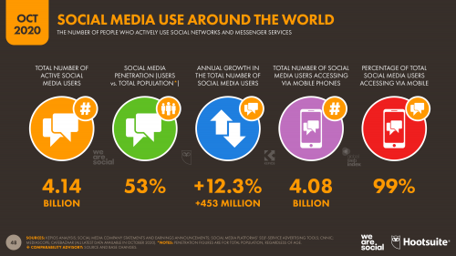
The mobile phone device channel represents 99% of social media usage.
If your business has a strong social media presence and you use this ability to drive visitors to your website and online offerings, but if potential customers end up in a clumsy, non-intuitive website experience, you risk losing your hard-earned following entirely.
Websites that are responsive are also easy to share. When customers find the content they like on your website and share it on their Twitter, Facebook, or LinkedIn pages, you want to make sure that everyone in their network can quickly access it, regardless of the device they’re using.
Easier To Manage
Separate desktop and mobile websites mean two designs and two codebases to update and manage. It also implies two different interfaces, each with its own set of information and media requirements.
Responsive web design integrates your marketing and SEO efforts, saving you valuable time and money on digital management and design and development process efficiencies.
Respond To The Changing Demands Of Future Technology
We have no idea where technology will drive digital media in the future. New wearable technology and browsing-enabled devices are continually being released. A responsive website keeps your digital offerings from looking outdated and out of date on any screen.
Final Thought
As you can see, there are various advantages to using responsive web design for your company and digital presence.
If your site is not yet responsive, a re-design with a modern, more fluid layout is a perfect way to start. This will assist you in determining which page elements are most important to you and your company!
Tip: Google Analytics on your website will help give you an indication of the number and % of users coming to your site on mobile, tablet and desktop devices. Knowing this you can assess a responsive website design strategy with the users vs device channel information.
Contact us if you need expertise in making your website responsive.


