
Essential Flutter Widgets When Developing Mobile Apps
June 5, 2024
Flutter is a popular framework for building beautiful and engaging mobile apps. Learning about the core widgets is essential if you’re new to Flutter development.
This article will introduce you to 2 essential Flutter widgets that you can use for every app that you create and also include the example code and demo app.
The Goals:
- Learning about Flutter development
- Getting started with Essential Widget in Flutter
- Can create an app using Widgets in Flutter
The Good Things:
- Flutter is an open source framework by Google for building beautiful, natively compiled, multi-platform applications from a single codebase.
- Flutter Widgets system gives more flexibility, able to combine multiple widgets
- Flutter has a very active and large community base
The Challenges:
- When enter into Flutter for the first time, it is very confusing because as we know, Flutter is a collection of widgets, so it makes confused, but after knowing the flow we will be amazed.
- Need to learn and adapt to a new programming language, namely Dart
First of all, let’s talk about the 2 widgets that we will discuss
Bottom Navigation Bar
The bottom navigation bar is a cool widget that has been given by the Flutter framework.
We can easily add a bottom navigation bar to the scaffold. In the scaffold, there is an attribute called bottom Navigation Bar and we can assign Bottom Navigation Bar for that. Inside the Bottom Navigation Bar class, we can define the navigation button’s behaviour and what the buttons need to show inside the bar.
There are mainly two attributes that are very useful when considering Bottom Navigation Bar.
Key Considerations:
type: This attribute governs the visual behaviour of the buttons when tapped. Choose between:
- fixed: Maintains a static appearance, ideal for a minimalist approach.
- shifting: Introduces a subtle animation effect when a button is selected, enhancing user engagement.
items: This crucial property takes a list of BottomNavigationBarItem objects, each representing a single navigation button. You’ll need at least two items to provide users with sufficient navigation options.
For Customising Navigation Items, each BottomNavigationBarItem object is comprised of two essential attributes:
- icon: This defines the visual representation of the button using an icon from an icon font or an image asset.
- label: While currently non-removable in Flutter, you can set the label to an empty string ("") if you prefer a purely icon-based navigation bar. However, remember that empty labels still occupy some space, potentially affecting the UI’s overall layout.
Grid View
The Grid View widget serves as a versatile tool for constructing scrollable grids of child widgets. It efficiently presents your content in a well-organised and visually pleasing manner.
Key Considerations:
- Child Widgets: The GridView widget acts as a container, housing an array of child widgets that you define. These child widgets can be anything from text and images to custom components, allowing you to tailor the grid’s content to your specific needs.
- Scroll Behaviour: By default, the GridView offers vertical scrolling functionality, enabling users to navigate through extensive lists of items within the grid. You can customise the scroll direction to horizontal if that better suits your data presentation.
- Grid Configuration: The GridView widget provides various properties for fine-tuning the grid’s layout.
- gridDelegate: This property controls the overall structure of the grid. You can specify the number of items per row (cross-axis count) and define the spacing between items using properties like crossAxisSpacing and mainAxisSpacing.
After we know the 2 essential widgets that are often used when building a mobile app, now our goal is to create an app using these two widgets, here I will put an example code that I have created.
Bottom Navigation Bar Widget
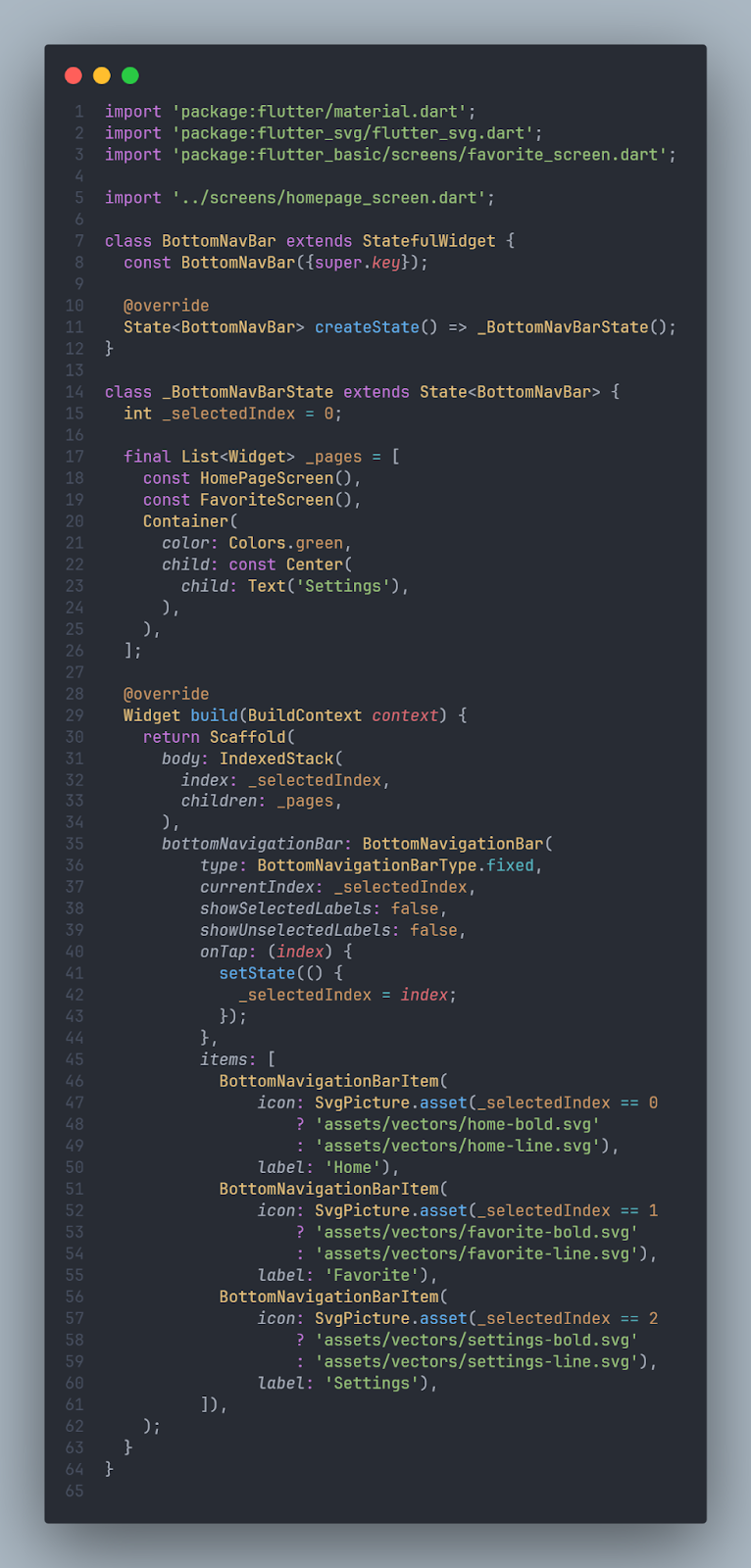
In the code above we create a Bottom Navigation Bar which has 3 tabs, namely Home, Favourites, and Settings.
Grid View Widget
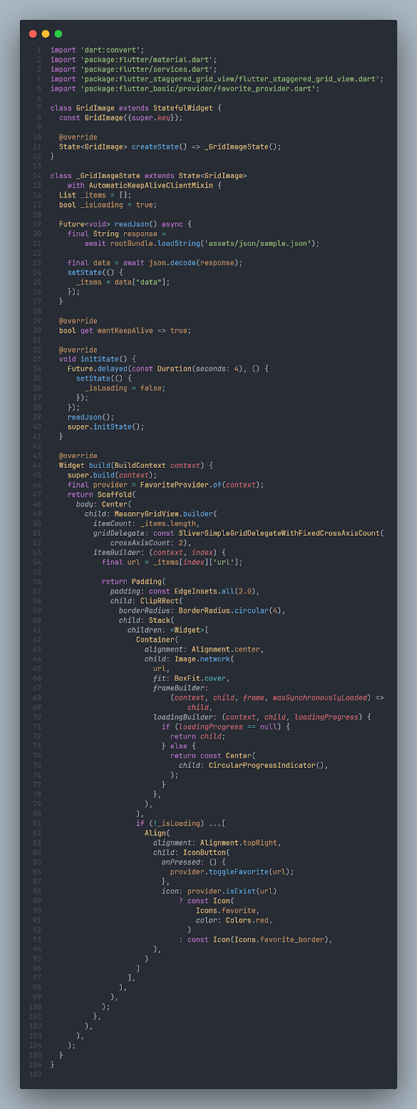
In the code above we create a Grid View which has 2 crossAxisCounts which means the grid will have 2 columns, apart from that this grid also gets value data via dummy JSON, the function can be seen in the readJson () code section.
Home Page Screen
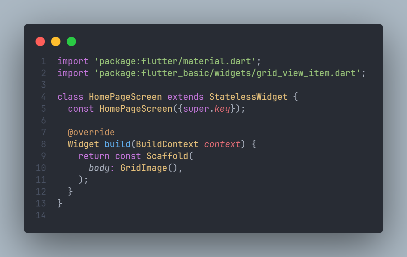
the code above used for display our home page screen with widget Grid View that we already created before.
Favourites Screen
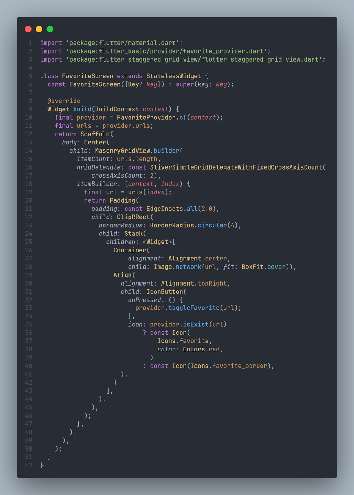
that code above used to display our favourite images that we selected.
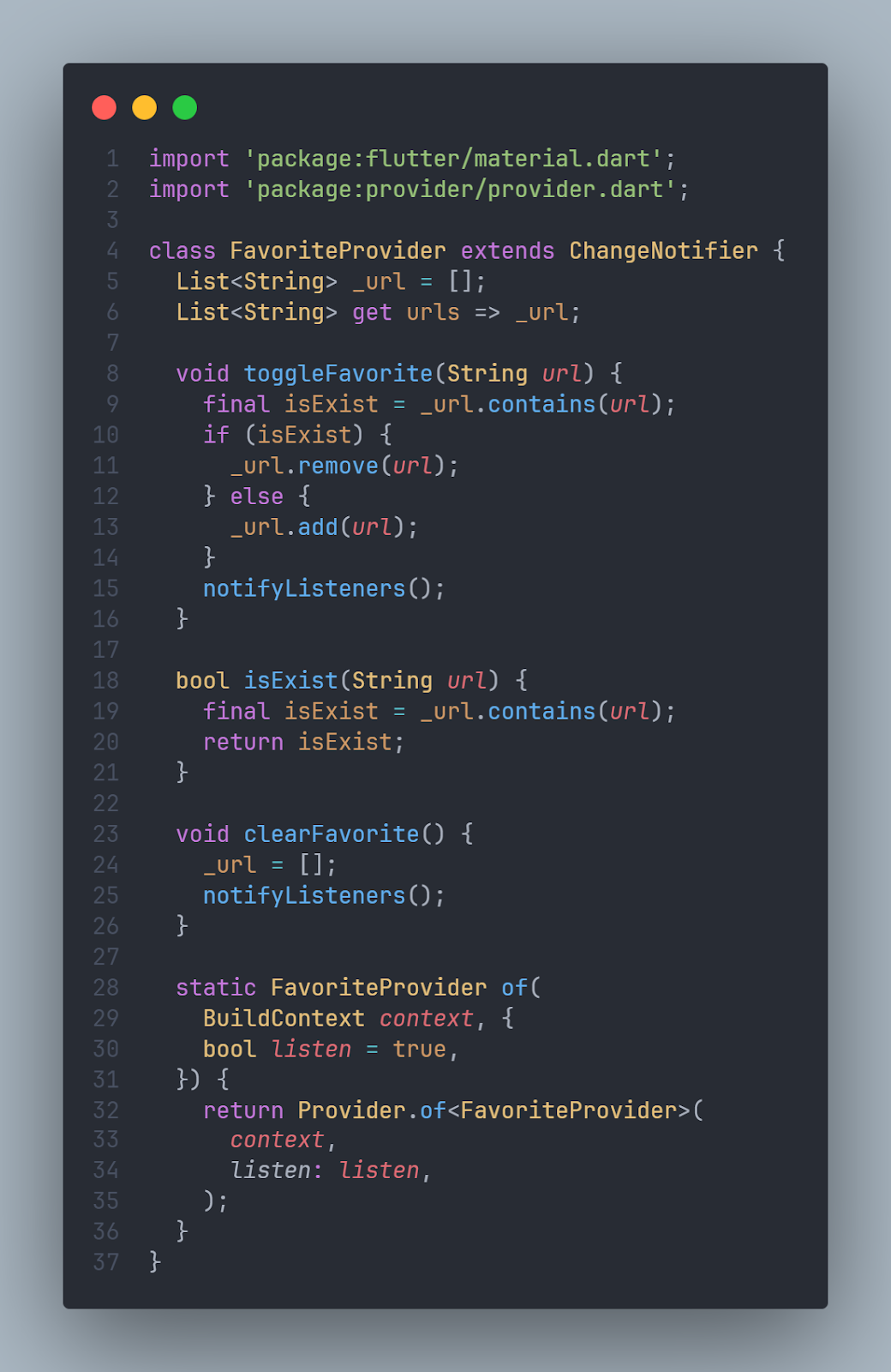
Provider
To add data to the favourite page, we create utils to handle it, the utils use the default Provider from Flutter, the implementation can be seen in the code below
then for the final step, just call the BottomNavigationBar widget which is already filled with the Grid view widget in main. dart.
Demo
Summary
Benefits of Flutter:
- It’s an open-source framework for building beautiful mobile apps with a single codebase.
- It’s development from year to year is very fast.
- has a large and active community base, making it easy to get information and learn about it.
Learning Curve
Getting started with Flutter requires learning Dart programming language and understanding its widget system.
Essential Widgets need to be learn:
- Bottom Navigation Bar: This widget provides a way to navigate between different sections of the app. It allows customization of appearance (fixed vs shifting) and button items (icon and label).
- Grid View: This widget is useful for displaying a scrollable grid of content, like images or text. It allows defining child widgets, scroll behavior (vertical/horizontal), and grid layout (number of items per row, spacing).
References
https://pub.dev/packages/flutter_staggered_grid_view
Are you looking for mobile app development?
We can help, let’s chat.
Written by:
Fibra Diarta [Fullstack developer at 42 Interactive]
- As a part of 42 Interactive training and research programme -


